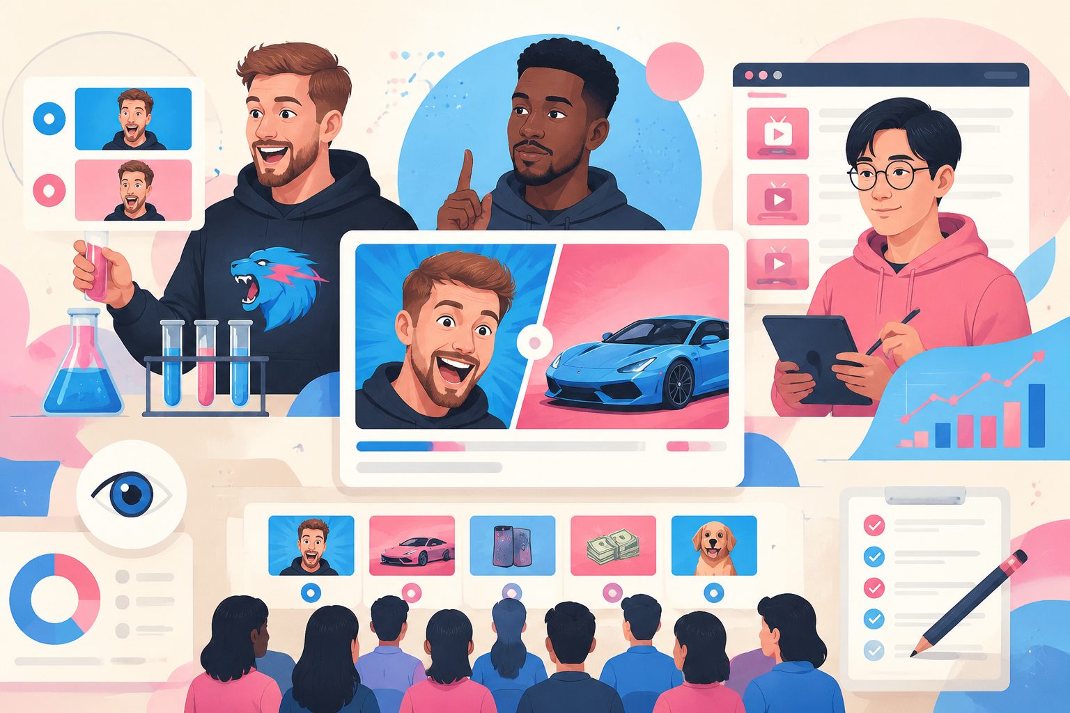
10 YouTube Thumbnail Rules from MrBeast, MKBHD & a Chinese A/B Experiment — Turned Into AI Prompts

Updated 2026-04-22 · All 10 rules below are baked into ChatIMG’s Video Cover Generator. Skip the reading and go use them.
Why I wrote this
Three independent signals pushed me to write this.
Signal 1 — MrBeast. He openly treats thumbnails as a science. His team A/B tests dozens of variants, swaps covers post-publish based on early CTR, and credits thumbnails as the single biggest lever on his 300M+ subs growth. His book-length “how to get views” memo and public interviews make it the most-studied thumbnail playbook in English YouTube.
Signal 2 — MKBHD and the minimalist camp. Marques Brownlee, Kurzgesagt, Fireship — three of the most consistently high-CTR channels in tech/explainer — all lean into minimal thumbnails: one focal point, strong contrast, no text overload. Different genre, same rule.
Signal 3 — He Tongxue’s fake Bilibili. In 2023, top Chinese creator He Tongxue built a fake-Bilibili mini-app called “GeliGeli”, loaded 4–6 candidate covers for each of his videos, and had 100+ blind testers vote on which one they’d most want to click. The video documenting the experiment got 10M+ views: To Find the Traffic Code, We Built a Fake Bilibili. It’s the most rigorous cover A/B study I know of run by a creator — and its conclusions exactly match what MrBeast and MKBHD practice.
When three independent sources — a Western views-king, a tech-review school, and a rigorous Chinese experiment — converge on the same rules, it’s worth writing down.
This post cross-references all three, distills 10 rules, and gives you an AI prompt for each one.
The 10 rules × AI prompts
1. Simplicity wins — information density is the killer
Evidence:
- He Tongxue’s experiment: simple covers had the highest CTR, no matter how the complex versions varied. Covers stuffed with icons, text, and stickers lost every time.
- MrBeast: “If you can’t describe your thumbnail in one sentence, it’s too complicated.”
- MKBHD, Fireship: one focal point, massive negative space, almost no text.
Prompt formula:
A YouTube thumbnail, 1280x720, MAXIMUM 3 visual elements: [main subject],
[one line of bold text], [one accent color]. Rest is solid color or clean gradient.
No stickers, no multiple text layers, no busy patterns.
2. Faces only for veterans — don’t show yours if you’re new
Evidence:
- He Tongxue’s experiment: big creator’s face = fan trust = click. A stranger’s face is a negative signal — viewers don’t auto-trigger curiosity for a face they don’t recognize.
- MrBeast, PewDiePie, MKBHD: their faces are brand assets.
- Kurzgesagt, Fireship, Veritasium (often): no face, strong symbol instead.
Prompt formula (for newcomers / no-face channels):
A video thumbnail WITHOUT a human face. Use [a strong symbol: tool / product / data / comparison]
as the main subject. Add one bold text overlay in red or yellow.
1280x720, high contrast.
Prompt formula (for established creators):
A video thumbnail, close-up of [specific description: e.g. man with glasses,
shocked expression, open mouth] taking 40% of left frame, right side [symbol + text].
Face must be crisp, backlit, eye-catching.
3. Cover text must NOT repeat the title — supplement or gap
Evidence:
- He Tongxue’s experiment: the most common cover mistake is “write it on the cover, write it in the title” — pure redundancy. Cover text is only a CTR booster when it adds something the title doesn’t say, or creates contrast/suspense.
- MrBeast’s rule: “The thumbnail should sell the payoff the title hides.”
- Example: Title = “I survived 100 days in Antarctica.” Cover text = “−47°C”.
Prompt formula:
A video thumbnail with ONE line of text. Title is "[your title]".
The cover text MUST NOT repeat the title. Instead:
- Reveal a SURPRISING NUMBER/FACT (e.g. "-47%")
- Pose a QUESTION the title answers
- Create CONTRAST (e.g. "Before → After")
3-6 words max.
4. Extreme contrast colors — the “MrBeast red + yellow + black” trio
Evidence:
- He Tongxue’s experiment: high-CTR covers all shared extreme contrast colors.
- MrBeast: red + yellow + black is his signature palette.
- Ryan Trahan, Airrack, and most top MrBeast-school creators: copy the palette, copy the CTR.
Prompt formula:
A video thumbnail using only 3 colors: pure red (#FF0000), bright yellow (#FFD700),
and deep black (#000000). Subject in center, red arrow or circle highlighting it,
yellow text overlay. No gradients, no pastels.
5. Exaggerated expressions — smiling isn’t enough
Evidence:
- He Tongxue’s experiment: the more dramatic the expression, the higher the CTR.
- MrBeast: the “O-mouth” is a trademark. “If you can see the back of their teeth, the CTR goes up.”
- Reaction-content creators (Casey Neistat’s late-era, SSSniperWolf, etc.): shocked face = default.
Prompt formula:
A video thumbnail featuring a [male/female] face with EXAGGERATED expression:
eyes wide open, mouth in an "O" shape, eyebrows raised to extreme.
Think "reaction thumbnail" style. Close-up, 60% of frame, dramatic lighting.
6. Numbers beat adjectives
Evidence:
- He Tongxue’s experiment: covers with concrete numbers outperformed covers with adjectives (“amazing”, “incredible”).
- MrBeast / Airrack: “$1 vs $1,000,000”, “I Spent 50 Hours Trapped In…”, “Last to leave wins $500,000”.
- Veritasium: “Why No One Has Measured The Speed Of Light” — number-fact hook in the title, mirrored in the cover.
Numbers give the brain a verifiable anchor. Adjectives give it nothing.
Prompt formula:
A video thumbnail with a BIG NUMBER as the focal point: "[specific number]"
displayed in huge bold font (80px+), centered. Supporting visual below.
Numbers like "$10,000", "30 days", "1 million" work best.
7. Arrows and circles — the simplest visual guide
Evidence:
- He Tongxue’s experiment: high-CTR covers used thick arrows, red circles, highlighter strokes to tell the eye “look here in 3 seconds”.
- MrBeast: a red circle or arrow appears on a majority of his covers.
- Reaction / commentary thumbnails across platforms: same trick.
Prompt formula:
A video thumbnail with a bright red circle (stroke 8px) around [main subject],
and a bold yellow arrow pointing from text to the circle.
The arrow should be hand-drawn style, not geometric.
8. Before/After is the universal template
Evidence:
- He Tongxue’s experiment: split-screen Before/After was near-unbeatable — Before on the left, After on the right, arrow between. The brain wants to know what happened.
- Fitness, transformation, DIY, home-renovation YouTube: built on this template.
- MrBeast’s “$1 vs $1,000,000” series IS this template at the concept level.
Prompt formula:
A video thumbnail split 50/50: LEFT shows [initial state] in desaturated tones
with text "BEFORE". RIGHT shows [result state] in vibrant colors with text "AFTER".
Arrow pointing right in the middle.
9. “Clean chaos” background — make the subject pop
Evidence:
- He Tongxue’s experiment: creators stuff backgrounds and bury the subject. Winning covers have extremely simple backgrounds (solid color / soft noise / blurred bokeh) that make the subject feel cut out.
- MKBHD: the product is always sharp-focused against a blurred gradient.
- Kurzgesagt: flat color behind illustrated subject.
Prompt formula:
A video thumbnail where the subject has strong outline/border against
a MINIMAL background: either pure solid color, or very soft blurred bokeh.
No busy textures behind the main subject. Subject should feel "cut out"
from the background.
10. Content is king — cover is only an amplifier
Evidence:
- He Tongxue’s experiment: cover + title are amplifiers, not deciders. Bad content + great cover = viewer bounces in 5 seconds. Good content + mediocre cover = CTR climbs over time.
- MrBeast, publicly: “No amount of thumbnail optimization will save a boring video.”
- YouTube Analytics 101: retention graph beats CTR in the ranking signal.
Prompt formula (none — this is mindset):
First ask: can the first 30 seconds of my video hold me? If not, don’t spend 3 hours on the cover. Fix the opening first.
5 meta-formulas
After absorbing the 10 rules, here are 5 “meta-formulas” you can rotate endlessly:
- [main subject] + [one short line] + [one accent color] — the simplicity formula
- [Before → After structure] + [arrow] — the contrast formula
- [exaggerated expression] + [shock symbol: ! / ? / burst] — the emotion formula
- [big number] + [supporting visual] + [contrast colors] — the data formula
- [symbol] (product/tool/icon) + [bold text] — the newcomer formula
Rotate these 5 across your next 10 videos and you’re already ahead of 90% of covers.
Verify your instinct against real YouTube data
Methodology is theory. Next step: verification. In our ChatIMG Cover Blind Arena:
- Real YouTube thumbnails → view counts / titles / channel names hidden
- You guess “which cover earned more views”
- Reveal real data, score your cover instinct
After 10 rounds you’ll find — the 10 rules above get validated again and again by real-world data.
FAQ
Q: Why cross-reference Chinese and English creators? A: Thumbnails are a visual language, not a linguistic one. Colors, contrast, expressions, numbers — these transcend Chinese / English / Spanish / Japanese. A rule that MrBeast (English, US) and He Tongxue (Chinese, Bilibili) independently arrive at is load-bearing precisely because they work in different markets. One-source methodology is weak; triangulated methodology ships.
Q: What’s the difference vs Canva / Pebblely / Fotor? A: Those are design tools (give you a usable image). We’re a traffic tool (give you an image that earns clicks) — the methodology is baked into the prompt, not something you drag-and-drop manually.
Q: Do these prompts work on all platforms? A: Yes — YouTube, Shorts, TikTok, Bilibili, Instagram Reels, X video. Colors, contrast, expressions, numbers are cross-cultural. Swap the text language and go.
Q: Who should I follow to keep learning? A: Four creators who publicly discuss cover/thumbnail strategy:
- MrBeast (youtube.com/@MrBeast) — A/B test at scale, red+yellow+black
- MKBHD (youtube.com/@mkbhd) — minimalism, product-as-hero
- Kurzgesagt (youtube.com/@kurzgesagt) — illustrated minimalism
- He Tongxue / 老师好我叫何同学 (Bilibili) — the fake-Bilibili experiment
Go
→ Enter the Video Cover Generator (10 prompts baked in) → Enter the Blind Arena (real YouTube data) → 30+ open prompt library
Sources cited:
- He Tongxue: To Find the Traffic Code, We Built a Fake Bilibili (2023-05-16, Bilibili @老师好我叫何同学)
- MrBeast public interviews & his “how to get views on YouTube” memo (Joe Rogan Experience #2158, Colin and Samir podcast)
- MKBHD channel trailer & thumbnail retrospectives (@mkbhd on YouTube)
More in this series
- Labubu Fashion Craze: The Evolution from Plush Toy to Emotional Healer Through Fashion
- Labubu Global Craze! Create Your Exclusive Labubu World with AI Image Generation
- Transform Your Photos into Studio Ghibli Art with ChatIMG iOS Shortcut
- Try GPT-4o Ghibli Style for Free! Chatimg.ai Launches Image to Video Feature
- No ChatGPT Plus Required! Use ChatIMG to Generate Amazing Ghibli-Style Images with GPT-4o